By Thomas Mihal, Positive Imaging
 Thomas Mihal
|
One of the terms that popped up during the rapid changes in visual communication is Colour Management. Artists, photographers, publishers, printers anybody who makes or uses pictures and graphics in a digitized format, talks about colour management.
But what is it really?
Some people think immediately of expensive software packages and even more expensive calibration equipment; others of well kept secrets only to be known by the members of an exclusive brotherhood of the initiated few.
We see a confusing variety of colour strips, and wedges, fancy patterns and patches, grey scales and control patterns with even more confusing brand names. They appear next to images on screens, proofs and prints to be evaluated by the matching calibration goodies who either feed the information magically back into some computer who in turn makes the necessary adjustments to the colour and tone values or you will be provided with some figures and data which will allow you to make accurate adjustments to the camera , printing machine, screen or the image itself
as long as you are able to interpret the data correctly and know how to apply it.
To me this is all a bit abstract. Visual communication is a creative field and most involved people are more intuitive then calculating by nature. The whole thing reminds me of the vast range of diets designed to make you loose weight. There are hundreds of different approaches just as many different methods a lot of them contradict each other and very few of them work.
So instead of subscribing to a program that includes a range of products and videos that come with a T-shirt and a membership card , it might be better to just eat less and run twice around the block every day; my point is : We must not loose sight of the actual reason for colour management.
First: What do we want?
We want an image that is true in colour, has contrast and density
Second: What is true ?
The original creation
Third: What is the end product ?
It could be a
· presentation using a digital projector
· photographic print
· digital image displayed on a screen
· digital print
· litho print (printed publications)
· e.t.c.
The aim of colour management is to make your final product look exactly like the image initially chosen. It starts with the artists choice of colour, the photographers choice of film, aperture and shutter speed. If digital photography is used then the choice of file format comes already into play.
Now we have the original creation.
The next step is, to turn the image into digital form (except if a photo has been created using a digital camera). This can be done by scanning or digital photography.
Colour management is crucial at that point because any deviation from the original will result in a loss of quality along the way. The digital image can be one of many file formats, the most popular being JPG and TIF.
At that stage the image must be adjusted to counteract the effect of any further processing; for example:
A model on a beach is to appear in a newspaper that is printed on matt, soggy paper: The white sand will have to be made purposely too bright because the paper is not pure white to start of with. The soft shadows on her body will have to be adjusted to a much paler tone to compensate for the spreading of ink during the printing process. A presentation using a digital projector will need a different range of light and colour then the same presentation on a website.
Art reproductions and books have a long established culture of colour management , In the past a large part of the production time and budget was spent on colour correction and retouching. This was done manually with chemicals by etching the plates or films one colour separation at a time. This process is now being done electronically, but it still needs the expertise of someone who knows the printing process. To do all this many programs have been written and every modern printer uses profiles which can be applied to proofing devises and print files.
If the artist, the photographer and the designer want to avoid disappointment and see their creations not compromised by technical limitations, there are a few points to be considered:
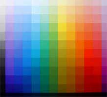 Johannes Itten: Colour Table
|
- Dont trust your computer screen for colour and brightness. Always have a test image resident on your hard drive in digital form, and the same image as a print somewhere where you can se it. This will allow you to evaluate any new images on your screen; even with a calibrated screen.
- Make sure your colour proofs are of good quality. A true proof does not mean pretty pictures. If the print is meant to be a proof it has to show the actual tonal and colour values without flattering and enhancing (unless the print is the final product). Some digital printers use additional inks to achieve colour tones that a conventional litho press for example cannot achieve.
- When going to litho, print work in CMYK. Some colours (light greens and bright oranges) look brilliant on your screen in RGB but loose a lot of their glow when printed in the process colours ( Cyan, Magenta, Yellow, Black).
- No reproduction can be better than the original. It is quite amazing what can be done to an image using program like Photoshop e.g. but the range of the original will always be compromised by corrective work.
- Trust your eyes more then technical data. Keep a colour control strip with your original during photography and proofing. Compare the original control strip with the ones on the subsequent proofs. But look only at the picture at the final stage.
Problems usually come only with corrective actions, more care at the start will prevent disappointment at the end.